current vs new UI at Dynamics 365 (D365)

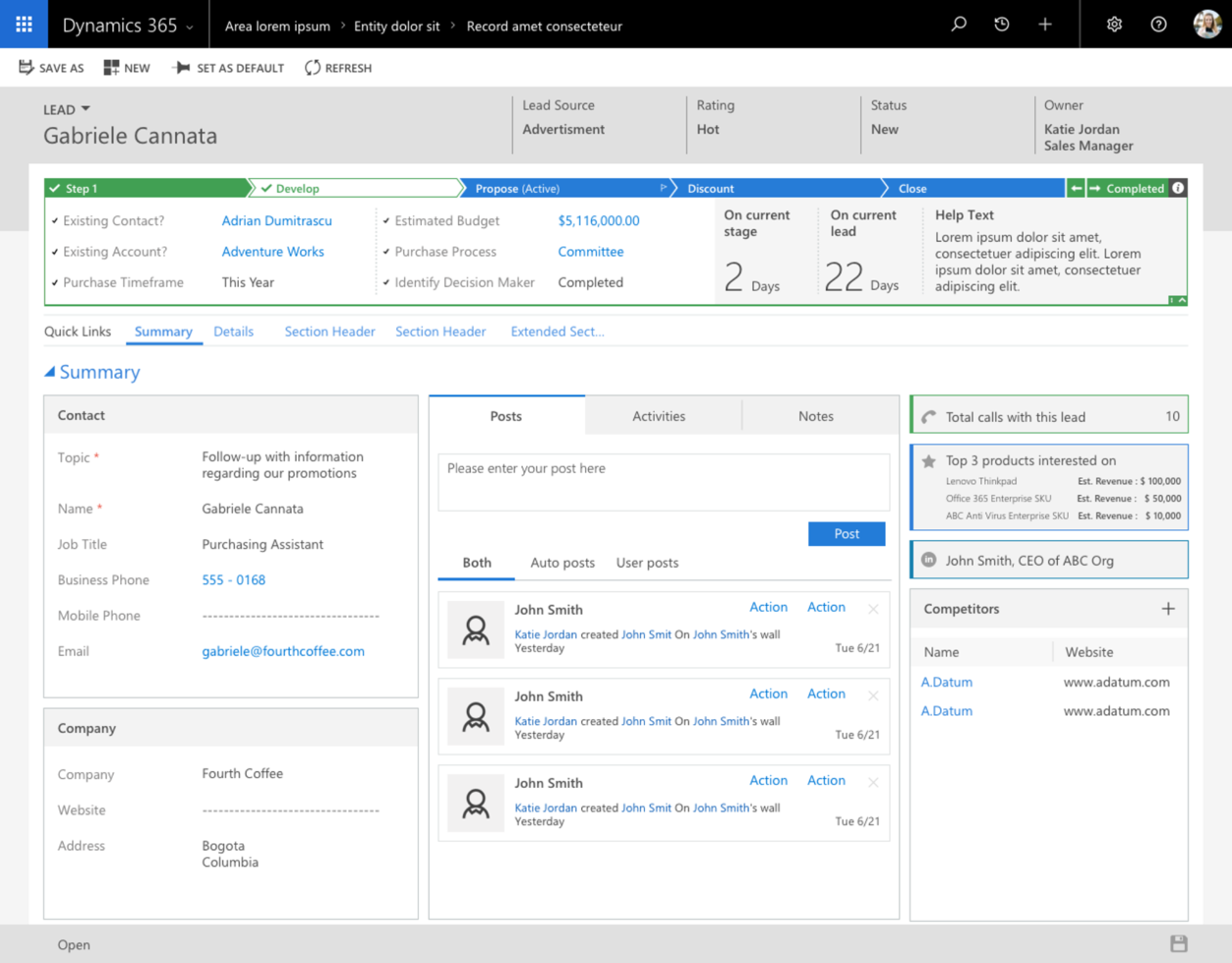
There is a significant difference between current vs new UI at #D365, isn’t it ?I believe a following screenshot is showing the difference well.

New UI looks better, not so much white space like in current UI. I really hope it  will be a game changer and it won’t break anything in existing CRM’ systems. New unified concept is very interesting challenge which could improve user experience with this product.

Unified Interface in Dynamics 365 – great job

Unified Interface in Dynamics 365 looks great, not so much white space like in current UI. The thing is, I just hope it won’t break anything in existing UI.

The challenging plan behind Unified Client Interface/Infrastructure “UCI” is to bring a single client technology to cover all the different UI’ s across many devices, Outlook, Web Mobile, …. – fingers crossed!

  1. Post about it on Linkedin with interesting opinions from CRM community:  https://www.linkedin.com/feed/update/urn:li:activity:629750374259389235
  2. Brilliant Brian’ article describes all features:  https://community.dynamics.com/enterprise/b/dynamics365fordevelopers/archive/2017/06/20/dynamics-365-v9-0-summary-july-2017-update
  3. Great article posted byJukka: https://community.dynamics.com/crm/b/survivingcrm/archive/2017/07/03/the-long-road-to-unified-interface-in-dynamics-365

Please click on following screenshots to enlarge them.